Brand Identity — 2022
ARYASA
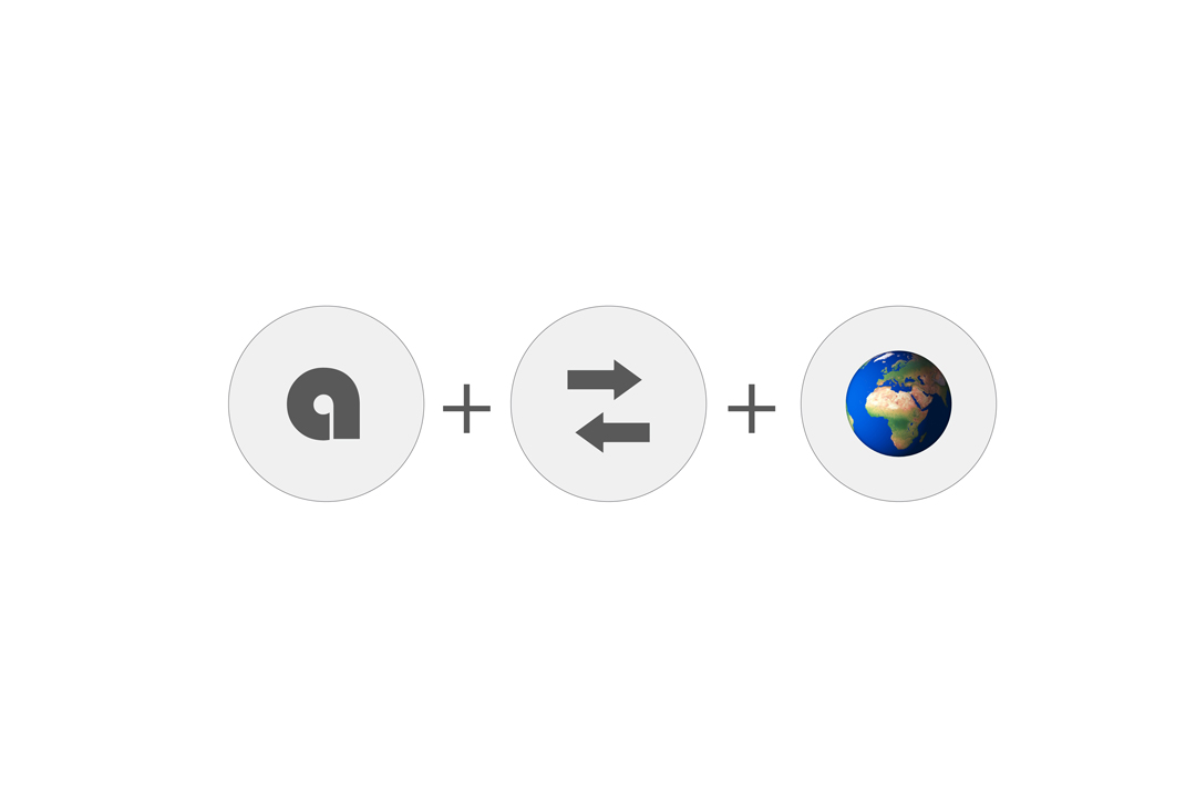
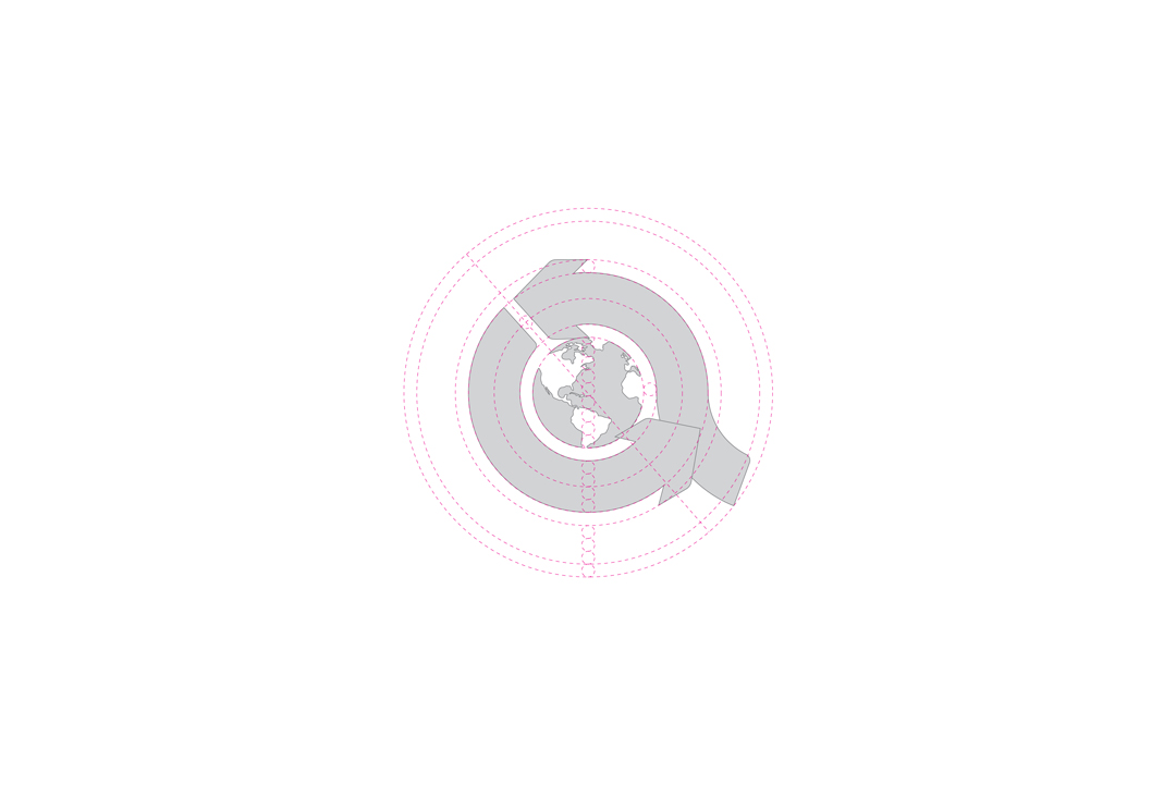
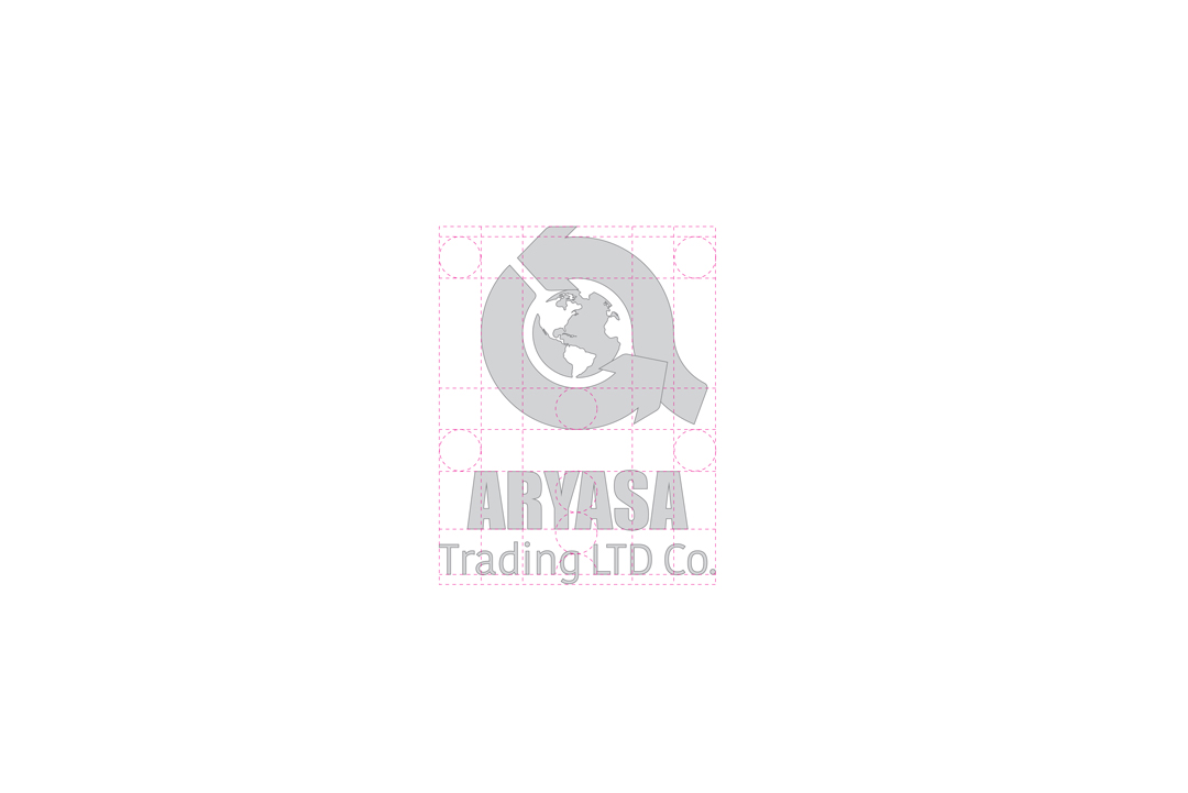
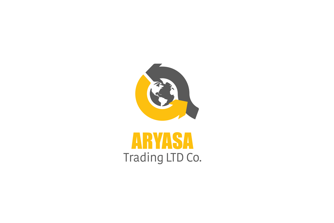
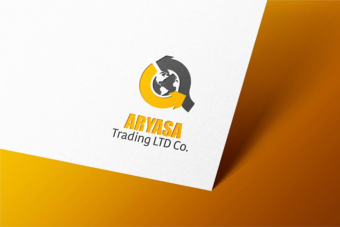
A combination of the first letter of company’s name with two arrows with opposite directions (as indicators of import and export) and also a picture of the earth planet (as a symbol of internationa interactions) have been used for designing this logo by the order of Aryasa Trading Company.The most important factor in designing a…
- Year
- 2022
- Category
- Brand Identity
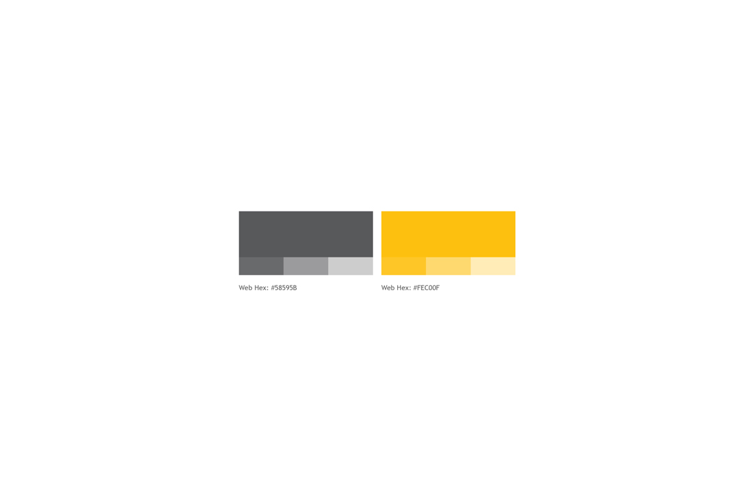
A combination of the first letter of company’s name with two arrows with opposite directions (as indicators of import and export) and also a picture of the earth planet (as a symbol of internationa interactions) have been used for designing this logo by the order of Aryasa Trading Company.The most important factor in designing a logo is choosing the appropriate colors, therefore you can easily highlight the business strengths and attract customers, and also choosing inappropriate colors can damage these factors as well.Therefore I have tried to induce a sense of friendship, energy and availability by using yellow.